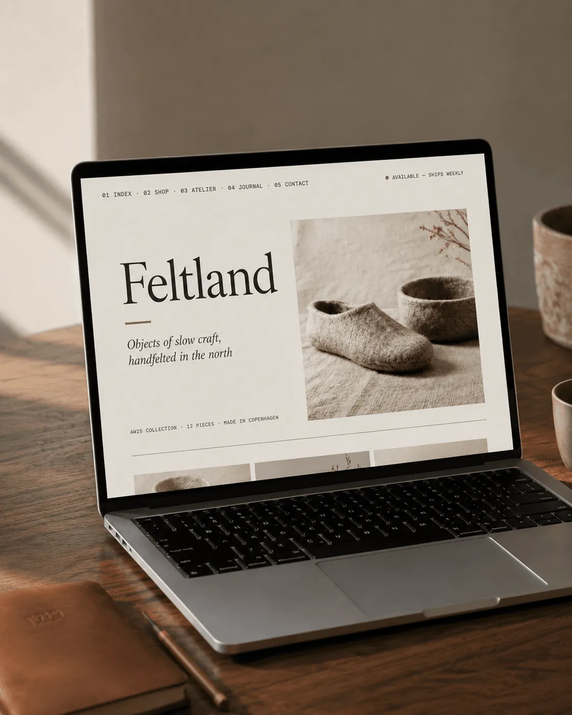
Meridian Type
Meridian Foundry · 2025
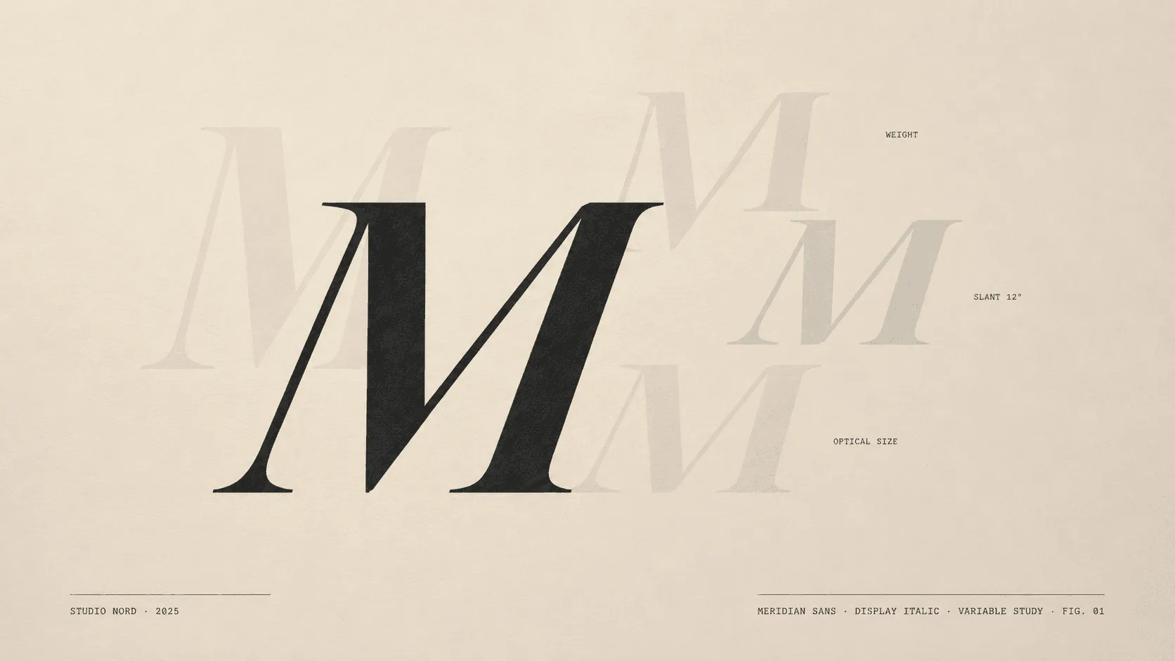
FIG. 01 — Meridian Type, motion, 2025
Client
Meridian Foundry
Year
2025
Scope
Type Design · Motion · Specimens
Recognition
Slanted #41 · Brand New
Meridian came to us in early 2025 with a brief that sounded simple — design us a flagship typeface, ship by autumn. What they did not say out loud, but became clear in the first week, was that they were also starting a foundry. The typeface would be the foundry’s first public statement. We spent three weeks before any drawing on what that statement should be. The answer, in our notes from that month, was the word considered.
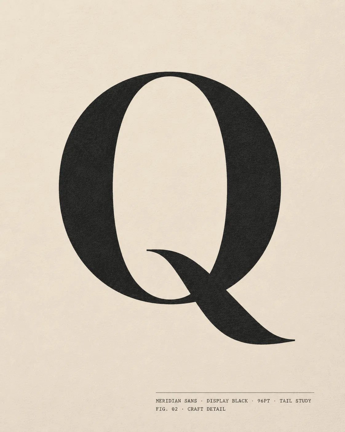
FIG. 02 — Meridian Sans Display Black, Q tail study
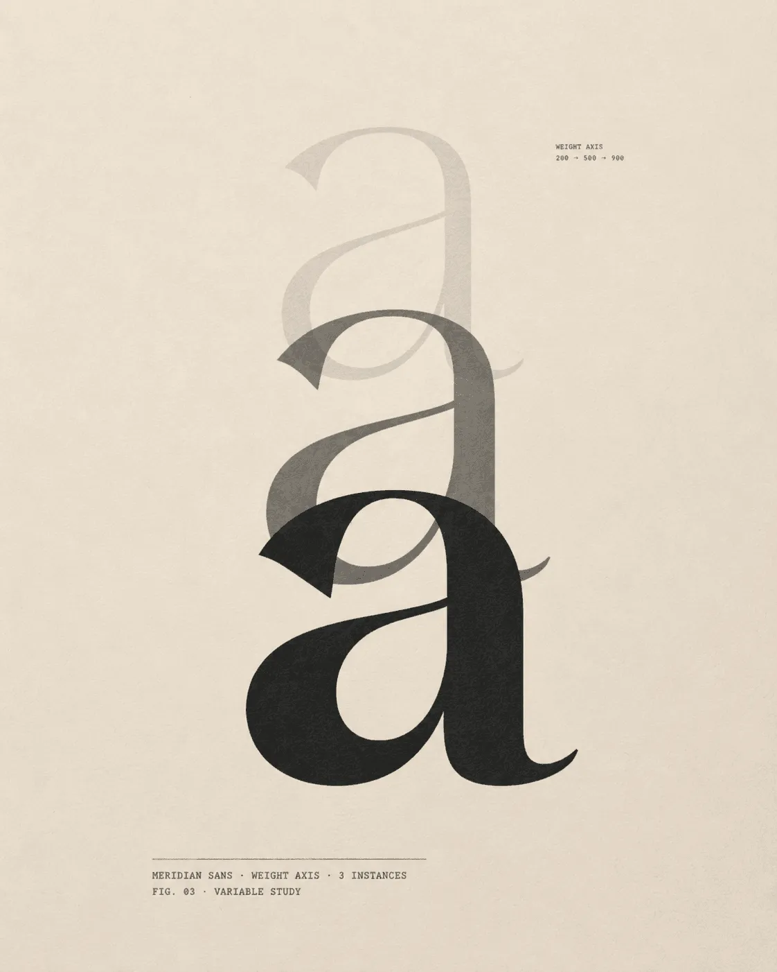
FIG. 03 — Variable axis weight transition, frame study
The typeface as a publication.
Meridian wanted the typeface release to read like the first chapter of a publication, not the launch of a product. That re-framed every decision. The specimen book became less a marketing piece and more a small editorial object. The motion specimens became less a feature demo and more a series of typographic essays — short, looped, designed to be watched the way one re-reads a paragraph.
The variable font system gave us range across four axes — weight, width, slant, optical size — but range alone was not the point. The point was restraint. We worked with Meridian to define a small set of canonical instances within the variable space: a Display Italic for headlines, a Regular Text for body, a Mono companion for technical settings. Sixteen styles in total, each one defended.
The motion specimens followed the same logic. Twelve looped sequences, each exploring a single axis transition — never multiple at once, never decorative. A weight loop. A slant loop. An optical size loop. Meridian’s foundry website now lives around these specimens, not around feature lists.
“We didn’t want the typeface to launch.
We wanted it to arrive.”
Magnus Holm, Designer

FIG. 04 — Specimen system, atelier wall, complete release set, 2025
Meridian Sans · Release 1.0
- Typeface
- Meridian Sans
- Family
- Display · Text · Mono companion
- Styles
- 16
- Variable axes
- Weight (100–900) · Width (75–125) · Slant (0°–12°) · Optical size (8–96pt)
- OpenType features
- liga · dlig · calt · kern · salt · ss01–ss06 · zero · frac · sups · sinf
- Language support
- Latin Extended · Vietnamese · basic Cyrillic
- License
- Desktop · Web · App · Variable
- Released
- 09 · Sep · 2025
A foundry, quietly.
Meridian Sans shipped in September 2025. The launch was deliberately small — a single email to the foundry’s existing list, a quiet announcement on a Tuesday. No countdown, no waitlist, no influencer rollout.
In the four months since, the typeface has been licensed by 47 independent studios and 3 publications. Slanted Magazine selected it for their 2025 type recap. Brand New featured the launch as a case study in foundry restraint.
Meridian is now drawing their second release. We are not designing it. That, too, was part of the brief — to build something the foundry could carry forward on their own.
Art Direction
Sofie Lindquist
Words
Sofie Lindquist
Brand Designer
Magnus Holm
Type Design
Magnus Holm
Motion Design
Magnus Holm
OpenType Engineering
Ida Skov
Print Production
Toldbøden Munck
Web Development
Ida Skov