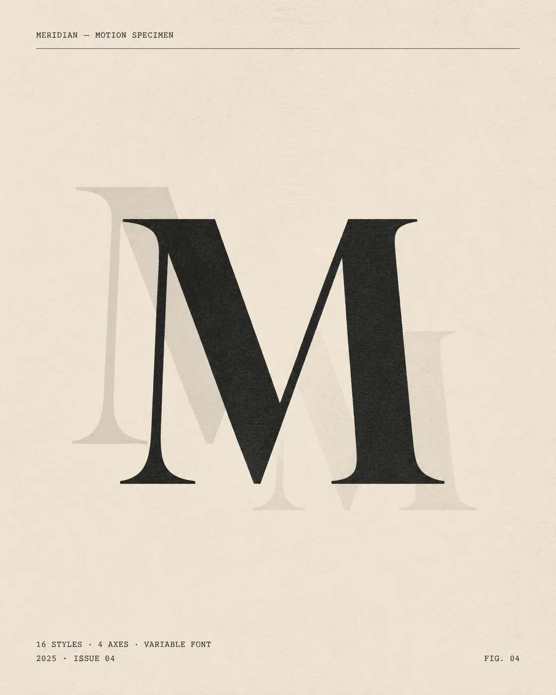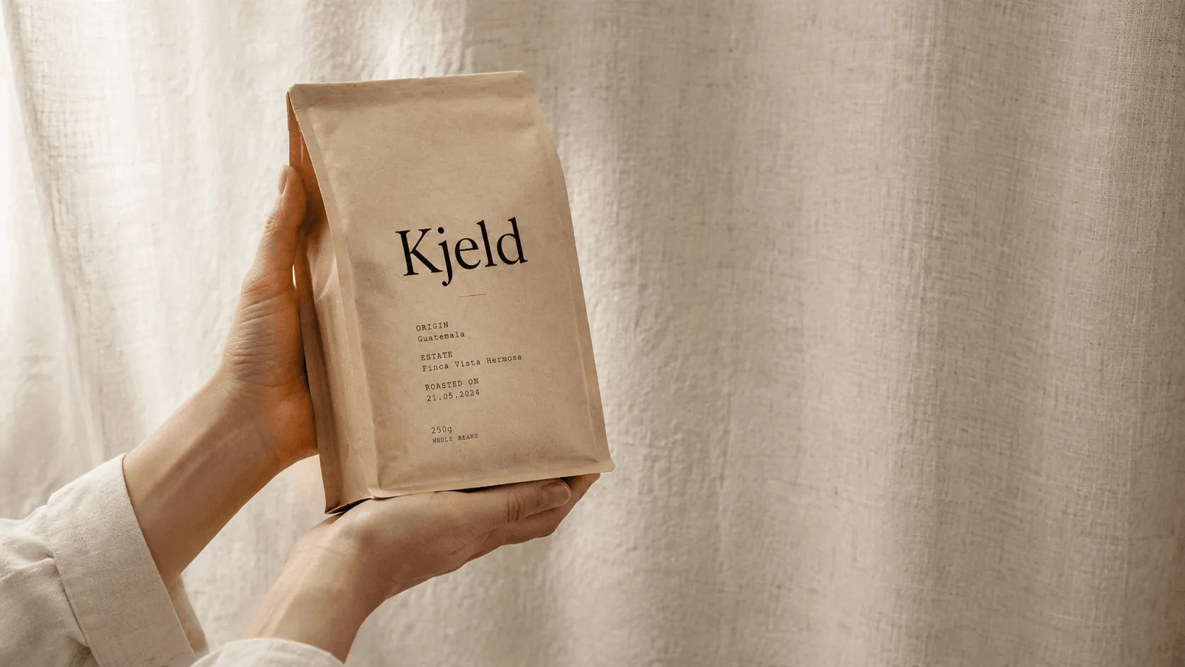
FIG. 01 — Kjeld & Co., branding, 2026
Client
Kjeld Coffee Roasters
Year
2026
Scope
Identity · Packaging · Site
Recognition
Awwwards SOTD · TDC
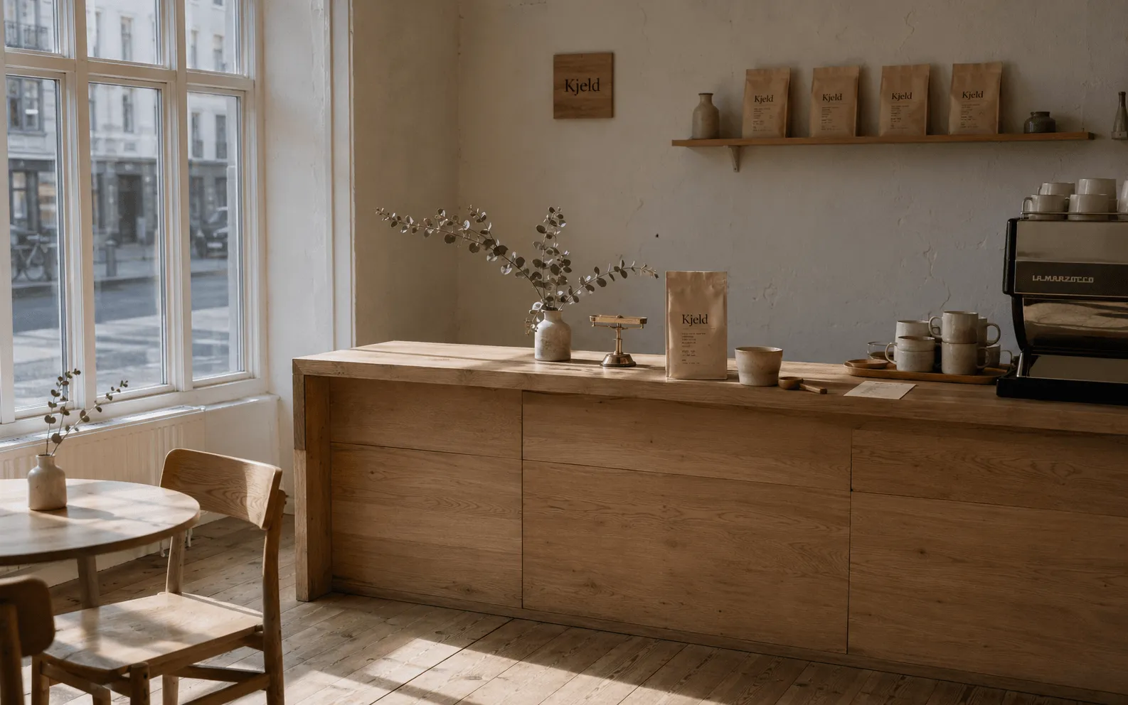
Kjeld is a third-generation roastery on Vesterbrogade. We rebuilt their identity around the quiet ritual of the morning cup — a Fraunces wordmark, a single weight of Geist for the specs, and a packaging system that ages with the bag. The brief, in the founder’s words, was simply: “Less.”
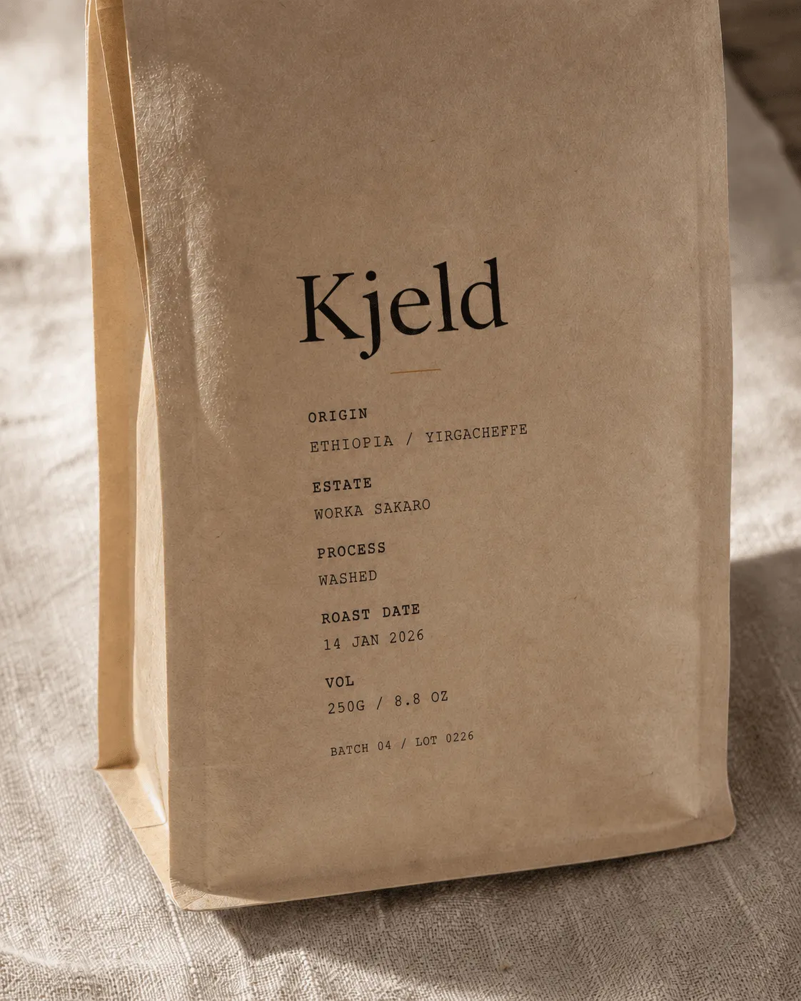
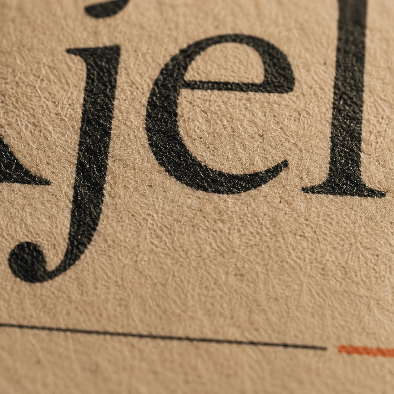
FIG. 03 — Wordmark on letterpressed business card
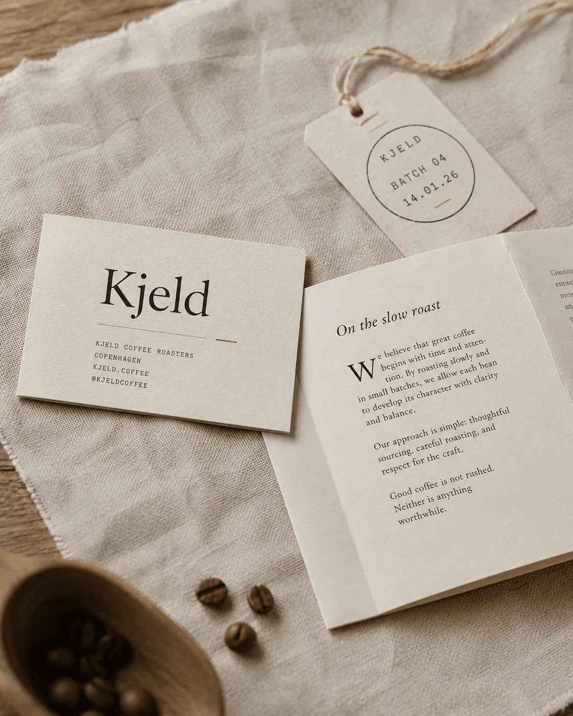
FIG. 04 — Single-origin retail packaging
“The kerning was the conversation. Once we got the wordmark right, everything else became a footnote.”
Astrid Lange, Founder
A system that ages with the bag.
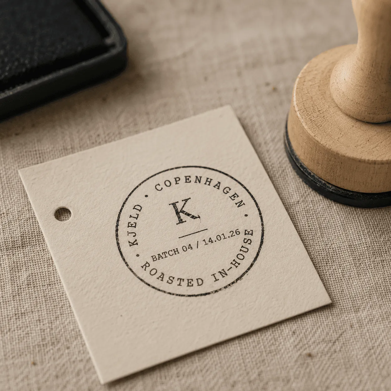
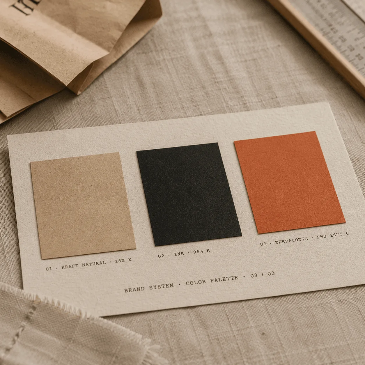
We designed three packaging variants — house, single-origin, and reserve — that share a single grid and a single type system. The label is printed in one Pantone on uncoated kraft; the specs are stamped on at the roastery the morning the beans are bagged.
The marque itself is a custom drawing built on Fraunces, with the ampersand redrawn from a 1962 ledger we found at the roastery. We held the wordmark at 80% optical size on the bag — small enough that it reads as a quiet detail, not a logo applied.
The site followed the same logic. Built on a content-first static stack, with a single column of editorial type, generous line-length, and a shop drawer that stays out of the way until you ask for it. We shipped in ten weeks; the team has been editing it themselves ever since.
Art Direction
Sofie Lindquist
Design
Magnus Holm, Sofie Lindquist
Development
Ida Skov
Photography
Anders Mølgaard
Print Production
Trykkeriet Munck, Aarhus
Client Team
Astrid Lange, Mads Kjeld